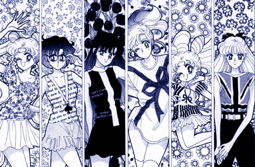
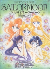
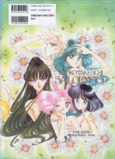
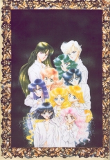
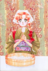
- Japanese title: Bishoujo Senshi Sailor Moon Genga-shuu Vol. IV
- Original art and text © Naoko TAKEUCHI
- Published October 5, 1997
- ISBN 4-06-324519-5
Click on images for the liner notes written by Naoko Takeuchi.
Closing Message from Naoko Takeuchi
“Naoko’s love and dreams towards Sailor Moon are all packed into this
book in various forms. With my heart, and a lifetime of sincerity, I
made this book for your sake. As you turn the page, if you could, in
the end, give me just a little bit of your loves and dreams… Naoko
would be very happy ♡ with love ♡ I deliver to you the Sailormoon
Picture Collection IV ♡”
Naoko Takeuchi
Translation © 2001 David Jao. Used with permission.
- 435x658mm
- Original picture collection cover & Pull-out poster [page 10]
- Media: Coloring pastel, marker, color spray, gel medium, beads, ink
- Paper: Fine BB Kent
Original Picture Collection Cover
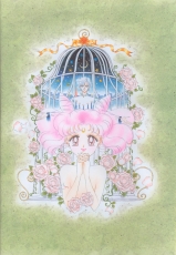
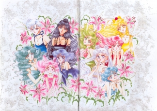
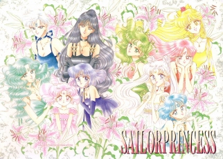
“The cover image of the fourth volume is green, a color which up to now has not appeared on the cover. The fourth volume’s cover image is a little different from the other ones up to now, as I experimented with drawing a little more heavily. (But the image didn’t really change that much. ☆ Of course it was still fun.) In the back I drew a flower spread using a species of chrysanthemum. The chrysanthemum’s figures are wonderfully varied. The Italian interior was printed in a magazine; I drew it here since I thought it was very charming. I also tried inserting my favorite pearl beads into this drawing of the 10 princesses.
The green came out very prettily ♡ (I was quite anxious. The colors in volumes I and II didn’t come out well at all.☆)”
- 420x310mm
- Drawn for the Original Picture Collection
- Media: Color ink, color spray, poster color, gel medium, beads, color copy
- Paper: Canson, leather cloth 82
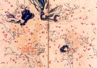
Drawn for the Original Picture Collection
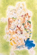
“In truth, I drew this picture for volume III of the original picture collection. This picture, with Hotaru-chan and the dark back, was supposed to be the front page of the third volume. In the third volume I mistakenly added an extra page into the page count, so I drew this page intending it for the front of the third volume. It’s a picture of the 10 girls with composed faces the way very likeable supermodels and idols are. Oh, and I also put in the beads that I’ve recently fallen in love with, just to see ♡ I wonder if it came out well.”
- 335x515mm
- Drawn for the Original Picture Collection
- Media: Color ink, color spray, pencil, gel medium, beads
- Paper: Arushu
Drawn for the Original Picture Collection
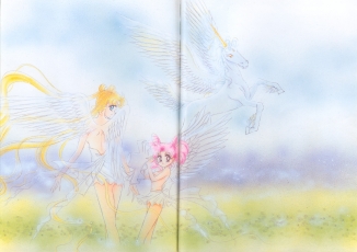
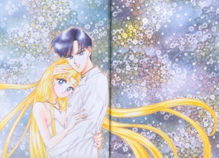
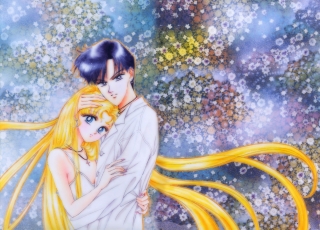
This illustration is spread over two pages. The scan above is taken from a Sailor Moon CD-ROM.
“A little earlier, while I was waiting in the car at a stoplight, suddenly I looked over on the rear view mirror of the neighboring car and saw a plumed pegasus-tail keyholder hanging from the end. Alas! This nice drawing is also of Erios’s plumed tail. The two girls’ pose (though a little ecchi) is very suited to them ♡ The glass-like glitter of the beads came out well in the printing.”
Kodansha Comics Vol. 15
- 374x272mm
- Kodansha Comics Vol. 15
- Media: Color ink, marker, pastel, color spray, texture gel, glass beads
- Paper: Canson
“Truth is, I was puzzling over whether to put this drawing or the next page’s drawing on the cover of vol. 15 of the comics. But it was previously decided that the color of the cover was to be white, so … with its cute look, this drawing was in accordance with the plan switched around to the back of the volume.”
Kodansha Comics Vol. 15 Cover
- 380x271mm
- Kodansha Comics Vol. 15 Cover
- Media: Color ink, marker, texture gel, glass beads
- Paper: Fine BB Kent
“Well, that means the cover picture of the 15th volume was this one. The medium lacquered on the back, with small glass grains mixed in, is my favorite painting base. ♡
Why do they say Usagi-chan is princess-like only in her costume? … oh, also, it wasn’t intentional, but I forgot to draw the crescent moon and the hair ornaments into the picture … sniff sniff”
May 1996 Nakayoshi Supplement
- 382x537mm
- 1996 Nakayoshi May supplement
- Media: Color ink, pastel, texture gel, glass beads
- Paper: Coarse BB Kent
[This illustration is spread over two pages. The first scan is from the artbook, the second is from the tankoubon pull-out poster.]
“This drawing was originally from a notebook of supplements intended for the fifth season, but for the climax of the fourth season consisting of the 10 girls in their princess figures, I put it into this book. I drew it in 1996 during New Year’s Day. New Year’s Eve they were recording the TV opening song, and New Year’s Day I was driving my car full speed to Yamanasi [lit. “pear mountain”, south/southwest of Tokyo –ed.]. There I paid the customary first temple visit for the New Year, and then returned to Tokyo, and drew this picture.”
Feb 1996 Nakayoshi Supplement
- 543x379mm
- 1996 Nakayoshi February supplement
- Media: Color ink, marker, gel medium, beads
- Paper: Fine BB Kent
“As it isn’t very appropriate for a compilation, ordinary girls individually can’t be made very engaging or in color … that’s what I think, anyway, and if we take 10 people descending the possibilities are rather limited no matter what we do …. Even so, in that kind of case it seems the vertical line-up combination has actually become common. Here everyone’s respective hairstyles are well suited to them. Isn’t it a little different from the usual image and look? This eventually became the supplement poster.”
Title page of Feb 1996 Nakayoshi
- 385x542mm
- 1996 Nakayoshi February first page
- Media: Color ink, marker, copy, tone, gel
- Paper: Fine BB Kent
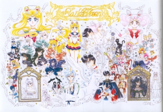
“This “all-characters” picture was used for the Nakayoshi magazine popularity contest. When it appeared in February, the Amazon Quartet had not appeared in the manga yet, but at Osabu’s request, I drew them in anyway ☆ As it turns out, even with a big piece of paper, there were so many people that many of them were drawn only sketchily, but still, it was great fun to draw this ♡”
Drawn for the 1996 calender
- 549x393mm
- Drawn for the 1996 calender
- Media: Color ink, marker, color spray, pencil
- Paper: OK feather waltz cherry
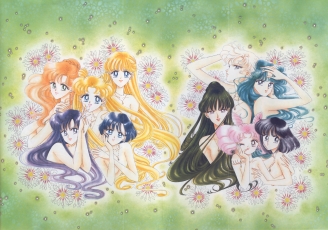
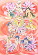
“This picture I drew is of the 10 girls just before they transform. Drawing them like this really is strange, isn’t it?
For this drawing of the 10 characters, I used green coloring ink to draw the main lines on fine paper, then painted the colors with marker. The flourescent orange back with flowers is special to this edition (but the flouresence didn’t come out in the printing). The 10 girls’ pose and facial expressions are similar to what they would be right after they start transforming, but I wonder if they aren’t a little too adult-like.”
Sep 1995 Nakayoshi preface
- 372x545mm
- 1995 Nakayoshi September preface
- Media: Color ink, marker, color spray
- Paper: Canson
[This illustration is spread over two pages. The first scan is from the artbook, the second is from the tankoubon pull-out poster.]
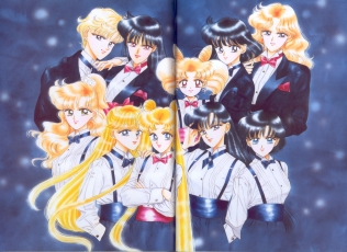
“I secretly call this drawing “10 girls in tuxedo disguises”. This picture was drawn on lightly colored purple paper. Both the color and the 10 girls’ uniforms are very pleasing ♡ Tuxedo Kamen-sama’s poor job is to choose between the 10 ♡”
Oct 1995 Nakayoshi preface
- 370x520mm
- 1995 Nakayoshi October preface
- Media: Color ink, Marker, color spray, poster color
- Paper: Coarse BB Kent
[This illustration is spread over two pages. The scan was merged into one image by Terralune.]
“The issues from the first half of ’95-’96 of Bou K company’s girls magazine “ViVi” were my favorite. ♡ The models were all bright, healthy, flashy, cute, and stylish. So this is my drawing of the pre-transformation high-school-student sailor soldiers.
That’s why this painting is done in the manner of ViVi’s models ♡”
Jan 1996 Nakayoshi preface
- 374x548mm
- 1996 Nakayoshi January preface
- Media: Color ink, marker, poster color
- Paper: Canson
[This illustration is spread over two pages. The first scan is from the artbook, the second is from either a poster or CD-ROM – not sure.]
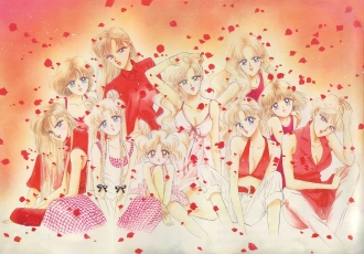
“One of the themes of the fourth season was “Dreams”. The 10 girls in this picture are dreaming. Looking at a picture of them sleeping in the nude in the midst of red rose-flower fireworks, the otherwise unremarkable red rose-flower fireworks actually seem quite pretty….
Huyumori-sensei, who managed the song productions in the musicals, spoke very well of this picture, and that made me very happy.”
July 1995 Nakayoshi preface
- 415x540mm
- 1995 Nakayoshi July preface
- Media: Color ink, marker, color spray
- Paper: Arushu, Japanese paper, classical tracing
[This illustration is spread over two pages. The scan was merged into one image by Aleli.]
“The charming staff members where I work told me that they liked this drawing, so I’ve come to like it too. The colors on the title piece were very refreshing and pretty (the Japanese paper on the back was very suitable too). They designated this work to appear on the cover of the 12th volume of the comics, but the color came out all wrong. *sniff*”
First page of Jan 1996 Nakayoshi
- 363x255mm
- 1996 Nakayoshi January first page
- Media: Color ink, color spray
- Paper: New grass & wood stained herb
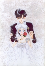
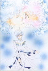
“I drew the main lines of the characters with thick blue color ink. I really like the indigo blue color ink.
It’s a very happy couple.”
First page of Oct 1995 Nakayoshi
- 508x320mm
- 1995 Nakayoshi October first page
- Media: Color ink, color spray, pencil, gel medium, beads, modeling paste
- Paper: Arushu [a brand of Japanese paper –ed.]
“The main lines of the characters are done in pencil. I varnished the back with modeling paste (to roughen up the surface, so that the paper looks like it’s made of clay. I like it ♡), then on top of that I put some gel medium to polish it, to which I glued the beads. When I was little, I really liked beads, so now I use them in my work a lot. The white paper is also very pleasing to me.”
Dec 1995 Nakayoshi preface
- 377x549mm
- 1995 Nakayoshi December preface
- Media: Color ink, color spray
- Paper: Canson
[This illustration is spread over two pages. The scan was merged into one image by Terralune.]
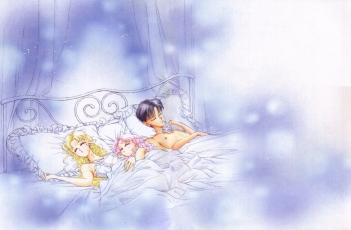
“Three people and one animal seeing happy dreams. When this drawing was being placed in the preface (hey! I’m reopening the series! it’s no time for sleeping ♡) I got a lot of complaints. (Also I thought the series was going to be discontinued.)
Maybe it was saved because of the anguished outcry from the Osabu director…
Osabu and Naoko both sleep a lot. And then we pass a lot of time asleep. AAAH how terrible.”
First page of July 1995 Nakayoshi
- 375x274mm
- 1995 Nakayoshi July first page
- Media: Color ink, color spray, marker
- Paper: Canson
“Erios (who inherited his irresponsible ways from me, but …) is wearing some awfully strange clothes eh? If I remember correctly, I didn’t have much time, so when I drew him I threw on some easy to draw clothes, deciding that those would be adequate. Now I think the ugly design of those clothes really is a disaster.”
First page of April 1995 Nakayoshi
- 367x260mm
- 1995 Nakayoshi April first page
- Media: Color ink, color spray, marker, color pencil, gel medium
- Paper: Fine BB Kent
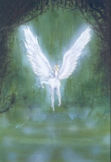
“The first page of the fourth volume was the first time we had this color on the first page. Why we decided on a Pegasus, I don’t remember. Here the Pegasus’s figure is reflected very clearly in the surface of the water. The feeling of transparency comes out in the painting, doesn’t it? The copy machine in my house has a very spiffy “mirror mode” which made the reflected image for me ♡ Copy machines are a really wonderful product of our modern civilization, nee?”
April 1995 Nakayoshi preface
- 370x545mm
- 1995 Nakayoshi April preface
- Media: Color ink, marker, color spray
- Paper: Canson
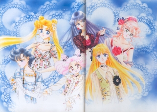
“For the preface of the April volume I really intended to draw something like “a picture of Sailor Moon and Chibiusa and Erios playing in the middle of the forest on the riverbank.” But then I changed my mind and drew this picture. To tell the truth, even as I was doing this I didn’t really want to draw yet another picture of the 6 of them in Western clothes. Cause there’s a lot of them out there already, but, well, that’s just the way it is I guess.
This picture was also put onto a telephone card.”
May 1995 Run-Run preface
- 354x248mm
- 1995 Run-Run May preface
- Media: Color ink, marker, tone
- Paper: Classic fabriano
“Being like Mako-chan, this is an extremely pleasing page. When I had the conversation about these three [this one, and the following two –ed.] appearing in print in Run-Run, in a meeting of the anime staff, they told me that they had decided on some other work instead. It was a pretty mean joke 😉 I really thought it was true.”
July 1995 Run-Run preface
- 375x275mm
- 1995 Run-Run July preface
- Media: Color ink, color spray, marker
- Paper: Canson
“This was the color preface to “Ami-chan’s first love” which was even made into a movie (awesome!). I never in my wildest dreams imagined that this manga would become a movie. At a private showing, all the fans watching it gave it a big reception, and I was very happy, but also a little embarrased. In the picture, the book that Ami-chan is reading is an ecchi book.”
- 390x269mm
- 1995 Run-Run November preface
- Media: Color ink, marker, color tone
- Paper: Kent
Nov 1995 Run-Run preface
“The two girls’ French nails (at first they were white, but then they got manicured and painted) are a very lucky color. The pair of Mina-P and Rei-chan is very pleasing ♡ Even on TV this team is in high demand. Fukami and Tomizawa are high-powered actresses. In fact, even in this drawing Rei-chan’s voice actress Ms. Tomizawa and Mina-P’s voice actress Ms. Fukami really give the roles a big lift ♡”
- 394x278mm
- 1995 Nakayoshi September first page
- Media: Color ink, marker, aero-flash
- Paper: Japanese paper
First page of Sep 1995 Nakayoshi
“This picture of the four girls in the art nouveau style is quite pleasing. Spreading out the shadows (the paper’s color helped too), I made it look old and faded. These four are on stage and all the fans on stage are receiving them with genuine pleasure.”
- 370x275mm
- 1995 Nakayoshi June preface
- Media: Color ink, marker, color spray
- Paper: Canson
June 1995 Nakayoshi preface
“The clothes being worn by the two girls are some designer’s clothes, drawn in consultation with them. They’re very nice, but today when the Nakayoshi editor saw it he said “Aaaaa! They look like Pierrots!” I suppose so, Pierrots huh. If he says that, I guess that must be the feeling he gets.”
- 372x276mm 540x390mm
- Aug 1996 Nakayoshi cover
- Media: Color ink, marker, spray
- Paper: Canson, Paradise, Hasyu color marine marble
Aug 1996 Nakayoshi Cover
“When I was drawing this picture, I was longing for some Tiffany’s stained glass. Of course I don’t expect to ever obtain such a rare, high priced item…. As a result of my constantly whining “Tiffany’s stained glass … stained glass …” I ended up doing this picture.”
- TOP: 395x260mm
- 1996 Nakayoshi January supplement
- Media: Color ink, color pastel, gel medium, beads, color copy, lace
- paper, color spray
- Paper: Coarse BB Kent, cloudscape
- BOTTOM: 179x247mm
- 1995 Nakayoshi December supplement
- Media: Marker, lace paper, seal
- Paper: fine quality paper, Edo stone crimson dyed flower
Jan 1996 Nakayoshi supplement / Dec 1995 Nakayoshi supplement
“The left [top] card was used in a calender supplement. The right [bottom] card became a coaster supplement. Both of them are really small cards. The lace paper that I used for the back is very lovely, since it makes the pictures very cute ♡ Both of them are Christmas drawings.”
- 384x274mm
- 1996 Nakayoshi January supplement
- Media: Color ink, marker, pastel
- Paper: Coarse BB Kent
Jan 1996 Nakayoshi supplement
“This is an illustration for the December calendar supplement. The mint green pastel on the back came out very beautifully. I really like the mint green color, but it’s just that the printing does not in every instance bring out its beauty.”
- TOP: 195x275mm
- 1995 Nakayoshi July supplement
- Media: Color ink, marker, color spray
- Paper: Paradise
- BOTTOM: 190x270mm
- 1995 Nakayoshi July supplement
- Media: Color ink, marker, color spray
- Paper: Fine BB Kent
July 1995 Nakayoshi supplements
“These two sheets are illustrations for supplementary letter set stationery. I made three fruit-themed illustrations for use in stationery, and it was a lot of fun ♡ I drew the strawberries in the left-hand yellow drawing on special paper and then combined it with the rest.”
- 352x297mm
- 1995 Nakayoshi July supplement
- Media: Color ink, marker, color copy
- Paper: Fine BB Kent, Paradise
July 1995 Nakayoshi supplement
“While I was slowly becoming accustomed to markers, I drew out this picture of these characters making heavy use of the marker. Like pastels, markers are used as a coloring tool, except it’s easier ♡ But I like the thinner colors because I’m more skilled with them and never mess them up. Even so, Bandai’s merchandise designer said I really was extremely skilled with markers! As if! I always find myself having to study more.”
- TOP: 192x267mm
- 1995 Nakayoshi July supplement
- Media: Color ink, marker
- Paper: Canson
- BOTTOM: 187x246mm
- 1995 Nakayoshi September supplement
- Media: Color ink, marker, color spray
- Paper: Canson
July 1995 Nakayoshi supplement / Sep 1995 Nakayoshi supplement
“The one on the left [top] is the envelope design of the supplementary lettersets. The two’s clothes were really supposed to be short sleeved, but I screwed up and made them long sleeves. The drawing of the two that they put on the card was really small, but Nakayoshi made really big beach towels with this drawing on them, and it was really cute ♡
“The one on the right [bottom] was a postcard supplement.”
- 380x271mm
- 1995 Nakayoshi December cover
- Media: Color ink, marker, color spray, seal
- Paper: Coarse BB Kent
Dec 1995 Nakayoshi cover
“When Nakayoshi put this on their cover, the painstakingly drawn lovely image of the two was hidden behind a bunch of words, and you almost couldn’t see any of it. 🙁
So, the drawing got kind of messed up. This picture was put as a design on square drawing paper, and also on postcards. Does anyone out there have a copy?”
- 246x187mm
- 1995 Nakayoshi September supplement
- Media: Marker, gel medium, beads
- Paper: Postcard, Paradise, Hasyu color marine marble
Sep 1995 Nakayoshi supplement
“This illustration was made into a supplementary postcard. In fact, I took one of the promotional postcards and redid the colors in the picture with marker, and then I glued this special postcard onto a plate, and glued on some beads. I’ve kept this hacked-up drawing ever since. Isn’t this fun?”
- 210x185mm, 117x150mm, 276x375mm, 260x245mm
- 1994 Nakayoshi September supplement, Nakayoshi May supplement
- Media: Coloring, marker, ink
- Paper: Canson, fine quality paper
Sep 1994 and May 1994 Nakayoshi supplements
“Haruka, Michiru, and Setsuna’s cards were used in a Sept. 1994 supplement file. I had intended to include them in the third original picture collection; I only had to draw Hotaru-chan’s, and on this page all 10 of them appear.
The cards for Usagi-chan and friends were distributed in a supplement to the lunch box merchandise. I wonder where the 10 girls would be going all dressed up like that.”
- 199x229mm
- 1995 Nakayoshi September frontispiece
- Media: Color ink, marker
- Paper: Fine BB Kent
Sep 1995 Nakayoshi frontispiece
“Here’s a picture of SD versions of the four soldiers.
These also became bonus stickers included in the ’96 tabletop calender. They were very popular with fans, who stuck a lot of them onto fan letters that they sent me. The question of what poses to use was something that I was thinking about for a while. I myself like most the pose where they’re in the middle of turning around. So, that’s what I used here.
- 270x384mm
- 1995 Nakayoshi September frontispiece
- Media: Color ink, marker
- Paper: Fine BB Kent
Sep 1995 Nakayoshi frontispiece
“For the Hong Kong edition of Nakayoshi this picture of the two girls was enlarged and used in the layout on the frontispiece. Since magnifying a picture, even under ideal circumstances, often leads to a rough and grainy appearance, I really didn’t like them doing it, but the layout was very fresh, and I thought it might work out. So they did the layout, magnifying the picture and publishing it.
- 185x112mm
- 1995 Nakayoshi July supplement
- Media: Color ink, water-based marker, tone, seal
- Paper: Canson
July 1995 Nakayoshi supplement
“This is an illustration from a Nakayoshi supplementary sticker. It was also used in the 12th volume of the comics. This illustration, along with the one on page 40 of the third picture collection, were printed on the two sides of the card. Anyone have it?
- 374x277mm
- 1995 Nakayoshi April cover
- Media: Color ink, marker
- Paper: Canson
April 1995 Nakayoshi supplement
“This was the cover on volume 4 no. 1 of Nakayoshi. It also had the privilege of being used on telephone cards. ♡
IIRC, the fourth volume was 73 pages long. I remember that the drawings of the amazon quartet were really terrible ☆
- 325x220mm
- Kodansha Comics Volume 12, no. 2
- Media: Color ink, marker
- Paper: Canson
Kodansha Comics Volume 12 inside cover
“This was drawn on pink Canson paper. The pink came out really pretty. For the portrait, I used gold oil-based marker. I really like the gold and silver ties ♡ I relied on poster color, ball point pen, and oil-based marker to capture the right mood. The finishing touches were made with water-based ball point pen. It was good to draw with something so smooth.
- 397x270mm
- 1995 Nakayoshi May first page
- Media: Color ink, color spray
- Paper: New grass & wood-stained herb, Japanese paper, classical
tracing paper
First page of May 1995 Nakayoshi
“Usually, I use a dedicated sheet of paper for print media, but this time I cut the figure out of a sheet of Japanese paper and pasted it on to serve as the back. So the edges of the paper got a little dirty ☆ On top of the Japanese paper, I pasted classical tracing paper and traced out a white design that I like and use very much ♡
- 368x534mm
- 1995 Nakayoshi May preface
- Media: Color ink, gel medium, color spray
- Paper: Canson
May 1995 Nakayoshi preface (Scanned from the tankoubon fold-out poster)
“Here’s the preface for Nakayoshi volume 4 no. 2. In the middle of this, Rei-chan’s backwards facing pose is one I like very much. On the bottom, I applied a masking of color spray. I myself really like the Mekanouma brand of color spray ♡ The color is pretty, and it’s easy to apply, and I like using it. ♡
- 380x270mm
- Kodansha Comics Volume 13 cover
- Media: Color ink, marker
- Paper: Fine BB Kent, Japanese paper
Kodansha Comics Volume 13 cover
“I did the KC volume 13 and volume 14 covers in a pair. I drew the main lines of the volume 13 cover in green ink. For the Japanese paper base on the back, I started with a sheet of yellow paper, and then pasted three more sheets of white paper on top of that. I spread some white on top of that.
- 389x281mm
- Kodansha Comics Volume 14 cover
- Media: Color ink, marker
- Paper: Fine BB Kent, Japanese paper
Kodansha Comics Volume 14 cover
“Now, this was a problematic little volume 14 cover picture. The base of this picture was really supposed to be blue-gray colored! On the volume 14 cover, for some reason the gray alone came through. I was shocked! ☆ So, for this printing, to make sure that the blue and gray would both properly come out, I drew over the main lines in blue ink.
- 396x271mm
- Drawn for the Original Picture Collection
- Media: Marker, color spray
- Paper: New grass & wood-stained laurel herb
Drawn for the Original Picture Collection
“In this book, this was the last drawing I did. These four were very active in the anime. Every week they were really cute ♡ I was very fortunate to be able to draw them like that. The way they roll around and catch the pool balls, is also very cute. But my favorite was the little dolls introduced by Bandai. With their costumes and faithfulness to the originals, the dolls really excelled. ♡
- 391x270mm
- Drawn for the Original Picture Collection
- Media: Marker, color spray, gel medium, beads
- Paper: Kent
Drawn for the Original Picture Collection
“These are human figures of Luna and Artemis and Diana. Diana’s human version ended up being surprisingly popular. The three ended up on TV, but in a stroke of really bad luck I wasn’t able to see them. 🙁 Aah, I really wanted Nishihara Kumiko to do the voice for Diana’s human version. ☆ As for Luna, her costume in this picture was specifically designed for this book compilation.
- 277x210mm
- Kodansha Comics Vol. 15 no. 2
- Media: Marker, color spray
- Paper: Copy paper, OK Feather Waltz, Japanese paper
Kodansha Comics Vol. 15 inside cover
“This is a drawing of the always shadowy, thin male characters.
In the anime, Chibiusa was always finding herself shoved out of the starring role; in the fourth season, Tuxedo Mask also had that spot, so I thought I’d draw him for the first time. But, as it turns out, I like drawing girls, even though I have a weakness for the shadowy thin men type ♡
- 365x255mm
- Kodansha Comics Vol. 15 pinup
- Media: Marker, modeling paste, color spray, instant lettering, water-based ball point pen
- Paper: OK Muse Kaiser [Japanese paper brand]
Kodansha Comics Vol. 15 pinup
“For this picture, I drew a sketch with pencil, then copied it onto manuscript paper and used marker to add color. These costumes don’t appear in the anime–it’s an image of the 8 girls as angels.
- 380x540mm
- 1996 February Nakayoshi preface
- Media: Color ink, marker, color spray
- Paper: Coarse BB Kent
1996 Feb Nakayoshi preface
“The nine soldiers here are all drawn in ink of their respective colors. They were then thinly colored in marker. Sailor Moon’s lines are in .05 milli black pigment. In almost all the monochrome and color manuscripts, this .05 milli black pigment was used. The nine new costumes were certainly used in the anime ♡ [translator’s note: they were not!]
- 390x278mm
- 1995 Nakayoshi March preface
- Media: Marker, color spray
- Paper: Kent
March 1995 Nakayoshi preface
“The final page of the Picture Collection IV was also the last preface page of the fourth season. It’s Eternal Sailor Moon. This illustration of Eternal Sailor Moon, in reality, was drawn in order to fulfill Toei’s requests. As for this picture, I myself really wanted it to become the cover for the fifth Sailor Stars book.
- 446x626mm
- 1995 Nakayoshi October supplement
- Media: Color ink, marker, color spray, poster color, lace paper
- Paper: Mega rain, Japanese paper
Oct 1995 Nakayoshi supplement
“This is a coloring done on a brand of light blue paper called “Mega rain”. It made it into the ’96 desk calender too, but the layout had a big mistake in it when it was sent out. ☆ A great shock. ☆ To everyone who bought the desk calender: sorry! Now I make sure to do the layout properly myself. The picture extends for the length of the 10 people.
- 527x642mm
- 1996 Nakayoshi May supplement (colorized)
- Media: Marker, pastel, tone
- Paper: Coarse BB Kent, Japanese paper
May 1996 Nakayoshi supplement
“Various artists suggested to me the idea of drawing this, and it seems I actually fell for it ☆ It’s a drawing of 10 princesses in the old style. ♡ The 10 are in their formal princess outfits. I think I saw a place in the anime where the ten girls with these figures were fluttering about (maybe it was a dream ♡).
