-
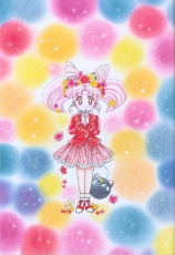
- Japanese title: Bishoujo Senshi Sailor Moon Genga-shuu Vol. II
- Original art and text © Naoko TAKEUCHI
- Published October 5, 1994. Hardcover.
- ISBN 4-06-324508-X
Click on images for the liner notes written by Naoko Takeuchi.
Closing Message from Naoko Takeuchi
“This postscript is continued from Picture Collection I.
It has been my dream for years to publish a picture collection. I still cannot believe that my publisher has even kindly published two collections. It is really like a dream.
Picture Collection I is a collection from color pictures of Sailor Moon Part 1. Picture Collection II is a collection from the color pictures of Part 2. Then, when Part 3 is over, there will be Picture Collection III.
It has been three years since I began the Sailor Moon serial. To tell you the truth, the past three years were supposed to be bad years for me. However, it seems like I have used up the good fortune of all my life in the past three years. This picture collection may be the peak of my good fortune. As soon as the picture collection is published, three years worth of bad luck may attack me. If that is the case there is nothing to regret because I was able to publish such wonderful picture collections.
Just kidding.
To create two picture collections while working on the Sailor Moon serial as well as other works was really difficult and required a lot of energy. But for someone like me who loves to draw color pictures, it brought me contentment to finish the pictures while looking at dawn at sea.
I would like to express my most sincere appreciation to the people who have listened to my many selfish requests. And Osabu, whom I love, thank you very much. When we finish this work, let’s go out to eat good food, rest a lot, and go and buy the glasses. I truly appreciate what you have done for me.
And, you, who hold this book in your hands, this is the book that I made for you. Please let me know what you think of it.
With all my love, I will bring Sailor Moon Picture Collection II to you.”
1994.7 Naoko Takeuchi
Translation © CP Language Institute. Used with permission.
- 473×670 mm
- Original Picture Collection II cover
- Medium: Color ink, Color spray, Color copy
- Paper type: BB Kent rough
“For a long time I had been intent on drawing Usagi and Chibi-Usagi against a red background with some flowers for the cover of the second volume. I prefer the characters’ faces without smiles. I like their expressions and poses, as well as the colors of the whole picture.”
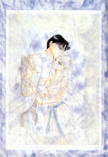
- 370 x272 mm
- Drawn for Picture Collection II
- Medium: Color ink, Poster color
- Paper type: Shin Kusaki-zome Nami-kuchi Shirakabe (New Glass and Tree Dye Medium Shirakabe)
“I initially planned to use this picture as a back cover. Instead, I used it as the first page of this collection thinking that it would best suit Sailor Moon Picture Collection, volume II. I really like it. I drew this picture and the one for the cover of this collection at the same time. In this picture I used my favorite art nouveau motif. In fact, I am dedicating my life to collecting art nouveau antiques.”
- 362 x 514 mm
- Drawn for Picture Collection II
- Medium: Color ink, Color Spray, Collage
- Paper type: Canson paper
[This illustration is spread over two pages. The scan was merged into one image by Terralune.]
“At the time when I was thinking about the rough sketch of this picture, Chibi-Usagi had not yet been born in my head. When I actually drew the rough sketch, there was an empty space next to Mako. I had left it like that for a long time and been feeling that the picture looked unbalanced. However, by adding Chibi-Usagi, the picture was finally complete. Now, Chibi-Usagi has come into an existence that we’d miss her when she’s not around.”
- 480 x 375 mm
- Drawn for Picture Collection II
- Medium: Color ink, Color spray
- Paper type: Sheep skin, Harsh color, Tracing paper
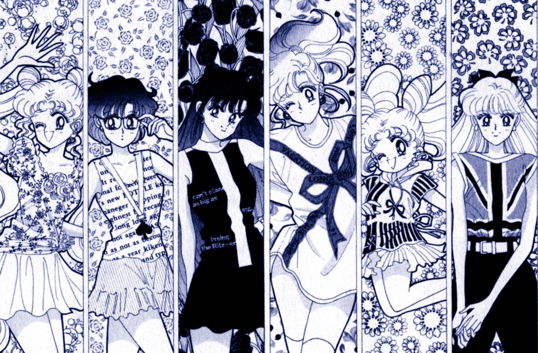
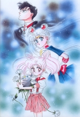
“I love buying clothes. I read magazine articles on clothing collections and browse catalogs from clothing stores every season. I would decide what to buy while telling myself, for example, “Ok, I will wear white this year.” The clothes on the two characters are from a designer that I wanted to purchase from a little while ago. However, I haven’t had many chances to go out recently and didn’t buy any, so I put the clothes on them.”
- 380 x 270 mm
- Frontispiece poster for April 1993 issue of Nakayoshi
- Medium: Color ink
- Paper type: BB Kent rough
“This picture became a supplemental poster to the April issue of Nakayoshi. I felt uneasy and wondered if everybody would really put it up. However, when I visited my cousin’s child, Mizuki, I found that this poster was hanging on the wall in her room. And she told me, “I like this poster the best.” Very happy to hear that.”
- 362 x 513 mm
- Title page of April 1993 issue of Nakayoshi
- Medium: Color ink, Modeling paste
- Paper type: Mermaid
[This illustration is spread over two pages. The scan was merged into one image by Diana.]
“This picture is very memorable because I finished it in a hurry and then took a
secret trip to Paris. It reminds me of a fantastic restaurant under the Eiffel Tower, a glittering merry-go-round, and a lovely small hotel on Vandome Square”
- 370 x 550 mm
- Title page of June 1993 issue of Nakayoshi
- Medium: Color ink
- Paper type: Canson paper
[This illustration is spread over two pages. The scan was merged into one image by Diana.]
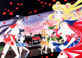
“Actually, I made a mistake on Mako’s right arm and put a patch on the spot. I was very happy when my friend, a comic book writer, said that “Sailor Moon’s face is sexy.” Yes, I wanted to draw a sexy picture. I really want Tuxedo Mask to ride the Porsche 962 LM, which is placed in the middle. I was happy to be able to draw the car.”
- 515 x 730 mm
- Pinup in Kodansha Comics Volume 4
- Medium: Color ink, Color spray
- Paper type: Canson paper
[This illustration is spread over two pages. The first scan was merged into one image by Diana. The second version was edited by Terralune.]
“I painted this picture as a gift for someone who is very important to me. However, Osabu, who is in charge, and I, being poor-natured, thought, “Let’s publish the picture somewhere first since I’ve already painted it.” And then we used it as a pinup, then a calendar, and I have not yet given it to the person whom it was intended for. Since I was able to include the picture in the collection, I thought, finally this time, I have the chance to give it you, dear Murakami.”
- 380 x 535 mm
- Cover of Kodansha Comics Volume 4
- Medium: Color ink, Color spray
- Paper type: BB Kent rough
[This illustration is spread over two pages. The scan was merged into one image by Diana.]
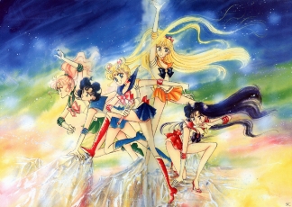
“This picture was on the cover of Sailor Moon Volume 4, whose first edition sold 1,200,000 copies. During the time I was working on the picture, it was confirmed that Sailor Moon would be adapted into a musical and I met the cast who would play the Sailor Soldiers recurrently. Perhaps because of this, the faces of the Sailor Soldiers in the picture resemble the cast members, Sakurakko. I might have drawn so unconsciously. How’s everybody?”
- 390 x 545 mm
- Title page of Sep 1993 issue of Nakayoshi
- Medium: Color ink, Color Spray
- Paper type: BB Kent rough
[This illustration is spread over two pages. The scan was merged into one image by Diana.]
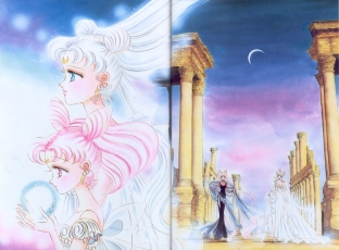
“Not being able to come up with a composition for the color title page, I really had problems with the expressions and the placement of Sailor Moon. As a result I didn’t like it very much. It was a little difficult to draw the Earth, which is in the background of Neo Queen Serenity. Anyway, I intended to create a cool picture.”
- 380 x 540 mm
- Title page of Dec 1993 issue of Nakayoshi
- Medium: Color ink, Pastel
- Paper type: BB Kent rough
[This illustration is spread over two pages. The scan was merged into one image by Terralune.]
“This is the picture in which the other soldiers are able to see Pluto and become determined to fight. I like the colors of the background. But a friend told me, “They are unusual colors.” This picture was the color title page of the December Issue of Nakayoshi. Osabu inserted the words: “The year of 1993 started with Sailor Moon and ends with Sailor Moon,” and my life this year could be exactly described by these same words.”
- 363 x 547 mm
- Title page of Oct 1993 issue of Nakayoshi
- Medium: Color ink, Color Spray
- Paper type: Canson paper
- [This picture is on two pages. The one-piece version is from a CD-ROM.]
“Looking at this picture, you can hear all the voice actors for Sailor Soldiers saying, “It is nice,” and I was very happy to hear that. It became popular among the people around me although I had no time and had to finish it in two hours or so. In the comics I usually cannot draw a scene for two characters like I did for this one, so I decided to paint them with colors.”
- 180 x 270 mm
- Back cover of Kodansha Comics Volume 7
- Medium: Color ink
- Paper type: Canson paper
“This is one of my favorite pictures. It started that I meant to draw it for the back cover of the comic book, volume 5. Having no time for it, however, I finally finished it for the back cover of volume 7. I am glad that I eventually completed it. This is meant to be a wine glass with Neo Queen Serenity’s milky glass stem.”
- 382 x 267 mm
- Cover of Kodansha Comics Volume 5
- Medium: Color ink
- Paper type: BB Kent rough
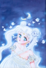
“Around the time I drew this picture I used to like scattering white rose petals in the comics. Princess Serenity has silver hair. I really like the colors purple, turquoise, and white.”
- 370 x 265 mm
- Original art, 1994 desk calendar
- Medium: Color ink, Color spray
- Paper type: Canson paper
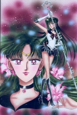
“This picture of Pluto was originally made to demonstrate the sample colors to Toei Animation. I inserted it in the text of the comic book volume 5 and received fan letters requesting, “I want to see it in color!” And I thought it over. I like the dark red in the picture. I especially enjoyed painting the lips. I also used the picture for a desk calendar for the year of 1994.”
- 420 x 287 mm
- Title page of Jan 1994 issue of Nakayoshi
- Medium: Color ink, Color spray, Poster color
- Paper type: Canson paper
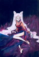
“This is my favorite Black Lady picture. I really like to draw pictures like this. It was easy and I could finish it in no time. I was not sure if the slit went too high up or if it was a bit extreme. But, to my surprise, the slit went even higher up in the animation. I watched it every week with my heart going pitter-pat.”
This picture is based on a Yves St. Laurent perfume ad.
- 380 x 540 mm
- Title page of Feb 1994 issue of Nakayoshi
- Medium: Color ink, Pastel
- Paper type: BB Kent rough
“I drew this picture as part of a set for the February Issue of Nakayoshi in1993. I like this picture although it ended up containing somewhat sad colors. Syria was the place closest to the image of destruction that I had in mind, but I did not have many actual references for it. As a result, I want to see it with my own naked eyes once, at any cost.”
- 180 x 270 mm
- Back cover of Kodansha Comics Volume 5
- Medium: Water color pencil, Color ink
- Paper type: BB Kent rough
“I kind of like Chibi-Usagi. When I drew her, I had Usagi’s child in mind. That’s why I decided that she would definitely have light pink hair with buns. Chibi-Usa is also Osabu’s favorite character. After all, her name is Chibi-Usa.
- 390 x 270 mm
- Drawn for Picture Collection II
- Medium: Water Color pencil, Color ink, Color spray, Color tone
- Paper type: Paradise, Lace paper
“Looking closely I found that the lace paper, which I had used for masking and intended to throw away, had beautiful colors. It would have been such a waste, so I drew Chibi-Usa on its blank area. “What a waste to throw it away” is perhaps one of my ethics at work.”
- 380 x 275 mm
- Cover of April 1993 issue of Nakayoshi
- Medium: Color ink, Color spray
- Paper type: Canson paper
“This is the cover of Nakayoshi-the month following Chibi-Usa’s debut appearance. Her hairstyle was not finalized then. The structure of her hair is truly a mystery. I didn’t think deeply when I designed it, so it was a surprise when I first saw a Chibi-Usa doll-I couldn’t believe that her hair could be three-dimensional. So I observed the doll’s head from various angles. A three-dimensional shape is wonderful.”
- 360 x 256 mm
- Title page of May 1993 issue of Nakayoshi
- Medium: Color ink, Color spray
- Paper type: Canson paper
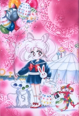
“This is the color picture that established the initial image of Chibi-Usa. I imagined that this kid has alien friends, and she would have a frown on her face in the beginning even when I took her to an amusement park. Moreover, I pictured that Luna P would secretly hide among the balloons we buy. I really like this picture, Chibi-Usa, and Luna P.”
- 380 x 265 mm
- Title page of Aug 1993 issue of Nakayoshi
- Medium: Color ink, Color Spray
- Paper type: BB Kent rough
“When I worked on this picture I really did not have any time or any ideas for the colors. Therefore, I finished it in about one hour halfheartedly. Later on, the chief editor said to me, “I like these colors,” and I felt deeply guilty.”
- 382 x 270 mm
- Title page of Nov 1993 issue of Nakayoshi
- Medium: Color ink, Pastel
- Paper type: BB Kent rough
“Chibi-Usa is very becoming with a blazer coat and a bow tie, but they have to be red. This kid looks best in red.”
- 370 x 550 mm
- Title page of July 1993 issue of Run-Run
- Medium: Color ink, Color Spray
- Paper type: Canson paper
[This illustration is spread over two pages. The scan was merged into one image by Terralune.]
“This is the color title page of the extra edition for Chibi-Usa. I am not very good at drawing children so it is difficult for me. Yet this time I was somehow able to draw Chibi-Usa’s face like a child’s. Osabu also praised me and said, “She is cute.” So it has become one of my favorite pictures, plus its flamboyant background.”
- 370 x 545 mm
- Pinup in July 1993 issue of Run-Run
- Medium: Color ink, Color spray
- Paper type: Canson paper
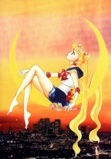
“I was happy and excited when I drew this picture because somebody bought me a pair of rabbit (Usagi) shaped pearl earrings and a matching necklace. I am sorry that the picture was so personal but I could not help it because I was really happy.”
- 362 x 260 mm
- Title page of Sep 1993 issue of Run-Run
- Medium: Color ink, Pastel
- Paper type: Canson paper
“This is the color title page of the extra edition for Rei. The title of this picture is “Casablanca Memory.” I remember that I was not happy with the work I did for this comic-I had little time, did not finish all the pages, and was not able to draw as I had wished. This color title page was the only picture that came out the way that I had wanted.”
- 400 x 270 mm
- Drawn for 1994 desk calendar
- Medium: Color ink, Color spray
- Paper type: Paradise
“I made a desk calendar for 1994 by putting together the pictures with flowers. January is cherry blossoms, February is spray chrysanthemums, March is cherry blossoms, April is casablanca [Lilium ‘Casa Blanca’], May is azaleas, June is gerberas, July is roses, August is hibiscus, September is sweet peas, October is cattleyas, November is roses, and December is also roses. Ami’s birthday is on September 10th, so she is on the September page.”
- 400 x 270 mm
- Drawn for 1994 desk calendar
- Medium: Water color pencil, Color ink
- Paper type: Paradise
“I wanted to include this picture in the collection no matter what. Because of its material, it was difficult to add color tone onto this kind of paper. Honma and Kana P, who put a lot of effort into it, thank you very much. It became a cool picture thanks to you.”
- 390 x 270 mm
- Drawn for 1994 desk calendar
- Medium: Color ink, Pastel
- Paper type: Paradise
“This is a picture for the desk calendar for November of 1994. Being able to draw Mako as I have imagined, I was satisfied with it. I was very particular about this desk calendar and was allowed to do it my own way. Does anybody have it?”
- 270 x 178 mm
- Supplement for April 1993 issue of Nakayoshi
- Medium: Color ink, Color tone
- Paper type: BB Kent smooth
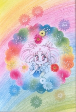
“This picture was drawn for the cover of a supplemental notebook for Nakayoshi. I like it despite the characters being small.”
- 380 x 268 mm
- Title page of July 1993 issue of Nakayoshi
- Medium: Color ink, Color tone
- Paper type: BB Kent, Rough
“The color tone is difficult. I want to use it but it seems that it doesn’t fit in with other pictures. I don’t remember which article noted it, since I had so many interviews, but one wrote that my colors were “ennui.” I was ecstatic from reading the article. Yes! That is what I am looking for.”
[Note: “ennui” is written in katakana but since the word means “a feeling of weariness and dissatisfaction”, that’s probably not the word she intended.]
- 384 x 560 mm
- Drawn for 1994 wall calendar
- Medium: Color ink, Color spray
- Paper type: Arches
[This illustration is spread over two pages. The scan was merged into one image by Terralune.]
“This picture was drawn for the April page of the wall calendar. I love cherry blossoms. Every April, the garden of my parents’ house looks as if it is entirely covered by a pink carpet. I admire the scenery from the window of my room. In 1994, I went to five or six scenic sites for cherry blossoms in Tokyo. It is sad when petals are all scattered.”
- 380 x 530 mm
- Cover of July 1993 issue of Nakayoshi
- Medium: Color ink
- Paper type: BB Kent rough
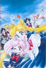
“The positioning of the four characters is unnatural because it was made as a color picture for the cover page of Nakayoshi and there were instructions regarding the positions of the characters. As always I had a hard time drawing a color picture while considering the placement of letters and so on.”
- 380 x 270 mm
- Supplement for Jan 1994 issue of Nakayoshi
- Medium: Water Color Pencil, Color ink, Pastel
- Paper type: Canson paper
“I don’t usually have the chance to draw pictures of Sailor Soldiers in Yukata so I was glad that, again this year, I was able to paint one.”
- 380 x 270 mm
- Cover of Dec 1993 issue of Nakayoshi
- Medium: Color ink, Color spray, Fiber-point pen
- Paper type: BB Kent rough
“Merry Christmas”
- 382 x 540 mm
- Cover of Feb 1994 issue of Nakayoshi
- Medium: Color ink, Color spray
- Paper type: BB Kent rough
“This picture was used on the autograph paper at the International Book Fair. A person from the Public Relations Department of Kodansha looked at it, and then laughed hard and said, “Their poses look like they are doing a two-man comedy act.” Ouuch! Since then, every time I look at the picture I see the words “a two-man comedy act….” Sob. Anyhow, Usagi is boke (the slow one in the two-man comedy) and Chibi-Usa is tukkomi (the quick one).”
- 270 x 380 mm
- Supplement for May 1993 issue of Nakayoshi
- Medium: Color ink
- Paper type: BB Kent rough
“This picture was drawn for a notebook which was a supplement to Nakayoshi. In general, the requests for the supplements are made very much in advance. When I was still working on Part One and trying to bring the story to a climax, I also had to draw for the supplements for Part Two. I think I was in a fluster as I tried to decide of what the shape the new Sailor Moon rod should be. I drew the shape of the brooch halfheartedly.”
- 275 x 200 mm
- Supplement for April 1993 issue of Nakayoshi
- Medium: Color ink, Color tone, Water color pencil
- Paper type: BB Kent rough
“Around this time the number of color pictures that I had to draw increased drastically. I had no time and ran out of ideas. I did not want to draw color pictures for a while. And I thought: “I am busy enough drawing the cover pages. Do I have to draw the supplements also?” This picture became the cover of a supplemental booklet titled Sailor Moon Official Fan Book, which analyzes Sailor Moon Part One. The booklet was made for substantial reading and was very interesting. Do you have it? I hope that they will print it again.”
Sailor Moon: 170 x 196 mm
Supplement for Aug 1993 issue of Nakayoshi
Medium: Color ink, Color spray
Paper type: Canson paper
“This is a cut from the special card collection of the supplement to Nakayoshi.”
Sailor Mercury: 230 x 145 mm
Supplement for Sep 1993 issue of Nakayoshi
Medium: Color ink
Paper type: BB Kent rough
“We included two supplemental cards every month as a part of the card collection.”
Sailor Mars: 110 x 145 mm
Supplement for Oct 1993 issue of Nakayoshi
Medium: Color ink, Color spray
Paper type: Canson paper
“Osabu said from behind me that this card was a monumental supplement because it has a hologram.”
Sailor Jupiter: 165 x 160 mm
Supplement for Nov 1993 issue of Nakayoshi
Medium: Color ink, Color spray
Paper type: Canson paper
“I put the individual’s data on the back of the card. It was harder to compile the data than to draw the picture.”
Sailor Venus: 275 x 230 mm
Supplement for Dec 1993 issue of Nakayoshi
Medium: Color ink, Color spray
Paper type: Canson paper
“It was difficult not to have the same color tone for all twelve pictures.”
Sailor Pluto: 210 x 193 mm
Supplement for Jan 1994 issue of Nakayoshi
Medium: Color ink, Color spray
Paper type: Canson paper.
“I think this picture of Pluto is my favorite among the twelve cards.”
Usagi: 197 x 100 mm
Supplement for Aug 1993 issue of Nakayoshi
Medium: Color ink, Water Color pencil
Paper type: Canson paper
“We gave out this card collection to the readers as telephone cards. Twelve cards in one set! What a luxury!”
Ami: 150 x 120 mm
Supplement for Sep 1993 issue of Nakayoshi
Medium: Color ink, Color tone
Paper type: BB Kent rough
“I heard that the editorial department has received many phone calls from the readers who failed to purchase some of the cards in the card collection. They were asking for the cards that they had missed.”
Rei: 145 x 103 mm
Supplement for Oct 1993 issue of Nakayoshi
Medium: Color ink, Color tone
Paper type: Canson paper
“Did everybody collect all of them?”
Makoto: 140 x 184 mm
Supplement for Nov 1993 issue of Nakayoshi
Medium: Color ink, Color spray
Paper type: Canson paper
“I had the idea of drawing Princess and Tuxedo Mask together so I am hoping for another supplement project in which I can use the idea.”
Minako: 273 x 140 mm
Supplement for Dec 1993 issue of Nakayoshi
Medium: Color ink, Color tone
Paper type: BB Kent rough
“Actually I am using these twelve cards as the title pages of files. They come in handy.”
Chibiusa: 212 x 135 mm
Supplement for Jan 1994 issue of Nakayoshi
Medium: Color ink, Color spray
Paper type: Canson paper
“I like little Luna P. She looks like a bomb.”
- 418 x 326 mm
- First page of Jan 1994 issue of Nakayoshi
- Medium: Water color pencil, Color ink, Fiber-tipped pen
- Paper type: Canson paper
“When I was painting colors on this picture, my staff asked me, “Is it going to be stickers?” I know. I wanted to make it into stickers but I was told that it would be too difficult to do so (because the picture has too many details). Osabu, will you make it into stickers? Let’s do it. There is nothing Osabu cannot do. So let’s do it!”
- 380 x 270 mm
- Cover of Kodansha Comics Volume 6
- Medium: Color ink, Color spray, Pastel, Tone
- Paper type: BB Kent rough
“While I was spraying sepia color on the background of this picture, the phone rang. I thought that I would spray while talking on the phone. I don’t know what I was thinking but I took a turquoise spray, which was next to the sepia spray, and sprayed it. That moment my mind went blank: a big turquoise colored stain on an almost completed picture. Yet it is not noticeable at all, right? These kinds of things always happen. When it comes to correcting, leave it to me.”
- 362 x 257 mm
- Title page of March 1994 issue of Nakayoshi
- Medium: Water color pencil, Color ink, Color spray, Pastel
- Paper type: Watson paper
“Osabu said, “Let’s put this picture on the last page.” So I did what he said. I couldn’t spend two hours on drawing that picture. As a result, I made some mistakes. Yet it was a memorable work since it became the color title page of the end of Part Two. Speaking of the color pictures, Osabu praises all of them, but which one do you like the best? Please let me know next time, ok?”
- 382 x 540 mm
- Pinup drawn for Picture Collection II
- Medium: Color ink, Color spray, Modeling paste, Pastel, Tone
- Paper type: BB Kent rough
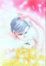
“I wanted to draw this picture for a long time, and finally was able to do so for the collection. I initially planned to draw it with darker colors but I really wanted to paint Usagi’s background in pink and needed to paint V’s hair in yellow. This is how my pictures have become more colorful and louder than they were originally planned.”
