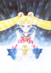
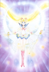
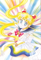
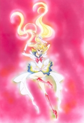
- Full title: Bishoujo Senshi Sailor Moon Genga-shuu (“Pretty Soldier Sailor Moon Original Picture Collection”) Vol. III
- Original art and text © Naoko TAKEUCHI
- Published October 5, 1996
- ISBN 4-06-324518-7
Click on images for the liner notes written by Naoko Takeuchi.
Closing Message
“I’m writing this while I look at the pretty night view of the heart of the city across the sea, which wasn’t there when I drew the third series of Sailor Moon.
Filling it with various memories of the third series, and my own slightly private memories,
I made this book for you.
Putting in my love, I give you
Sailor Moon Picture Collection III.”
Naoko Takeuchi
Translation © 1998 Kurozuki (Alex Glover). Used with permission.
- Original Picture Collection cover.
- 464 X 678 mm.
- Media: Color ink, marker, color spray, modeling paste.
- Paper: Fine BB Kent.
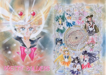
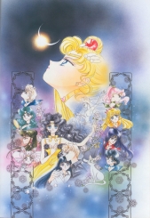
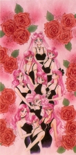
“I wanted to do the Picture Collection Volume III cover with dark colors. The story was dark, the pictures were stormy (all my fans, I’m really sorry), and the color of the tenth sailor soldier, Sailor Saturn, who appeared at the climax, is purple. As a reference for the pose of the ten soldiers, I used an embarrassing adult magazine my editor Osabu bought for me in Shinjuku.
When I first penned this picture, I didn’t really like it, so I outlined it again. I drew and I drew, and it took a lot of time, but I like it now. I drew this for all my fans, putting my heart into it. It’s also being made into a poster.”
- 485 X 326 mm.
- Drawn for use in the Picture Collection.
- Media: Color ink, pastel, marker.
- Paper: Arche
Drawn for use in the Picture Collection
“Actually, I started drawing this picture for manga volume 12. The flowers in the background are anemones. It’s a Mueller lamp motif, like I have hanging from my bedroom ceiling now. It’s a really pretty blue and yellow lamp. While I was on my bed gazing at the lamp, I thought of drawing with those colors, and I drew this.”
- 374 X 274 mm.
- Drawn for use in the Picture Collection.
- Media: Color ink, marker, color spray, aeroflash.
- Paper: Canson.
“Haruka-sama’s beloved car is the Ferrari 512M. If you ask why such a minor car, it’s because it’s actually my favorite car. The color is a secret. The model for Haruka-sama’s pose was my editor Osabu. I went to Number 13 with Osabu in the 512, carrying a Hikawa (!) Shrine evil spirit arrow from a fan, and chose this. I’m glad the car’s blue comes out well. I dedicate this to all the Haruka fans.”
- 383 X 266 mm.
- Drawn for use in the Picture Collection.
- Media: Color ink, marker, pastel, aeroflash.
- Paper: Fine BB Kent.
“What Michiru-sama is playing is the cello. Osabu played the cello when he was in school. He said to me, “The cello is a good match for Michiru-sama. Since skilled people spread their legs wide, you can tell from the way Michiru-sama spreads her legs that she’s a pro.” I didn’t know that! I dedicate this picture to Osabu and all the Michiru fans.”
- 410 X 317 mm.
- Drawn for use in the Picture Collection.
- Media: Color ink, marker, poster color, color spray.
- Paper: Marble cloud, Japanese paper.
“Setsuna-sama’s clothes are something supermodel Naomi Campbell wore. I love supermodels. I’m so envious of being able to wear all kinds of clothes. As you’d expect, Setsuna-sama has a black dress. I scattered in gold poster color, but I wonder how I’ll feel about it when it’s printed. I dedicate this picture to all the Setsuna fans.”
- 376 X 274 mm.
- Drawn for use in the Picture Collection.
- Media: Color ink, marker, aeroflash.
- Paper: Canson.
“Hotaru-chan is in the Maxim de Paris of Shanghai. It’s a French restaurant. The interior of the Maxim of Paris I went to with Ikuko-mama and Kenji-papa also had an antique, lovely design. But I was so tired and sleepy that time, the taste of their unmatched cooking… I don’t remember it. Mom, Dad, was it good? I dedicate this picture to Mom, Dad, and all the Hotaru fan”
- 533 X 395 mm.
Title page of the February 1995 Nakayoshi. - Media: Marker, color ink, color spray.
- Paper: Mermaid.
“When I saw a CG-animated dinosaur standing in front of a huge blue moon background, I thought it was really cool! I drew this thinking a blue moon could be nice. When we were laying out this picture, Osabu and I studied one thing. That was ‘kenzan’ read as ‘genzan’. This was used when the title page had the phrase, “See all the sailor soldiers here.””
- 362 X 515 mm.
- Title page of the January 1995 Nakayoshi.
- Media: Color ink, marker, color spray.
- Paper: Canson board.
- [This picture is on two pages. This one-piece version is from a tankoubon poster.]
“I started drawing this picture all of a sudden on board. When I draw color, I always do a rough on copy paper first. I worry a lot. But I decided to do this picture all at once! When I drew this, I was nervous because I had just had a month-long vacation. I think I drew the faces of all ten as suits them. I’m really happy this was included in the movie pamphlet.”
- 362 X 515 mm.
- Title page of the October 1995 Nakayoshi.
- Media: Color ink, color spray, pastel, tone.
- Paper: OK Feather Waltz green grass.
- [This picture is on two pages. This one-piece version is from a tankoubon poster.]
“I drew this picture on green paper. Sailor Moon’s outline is in pencil. I wanted to do a picture in the style of the Czech artist popular among shoujo manga artists, Mucha. I like Sailor Moon’s face and the sort of dark coloring of the picture. I’ve also used this picture for notes. I use it now every month for my fifth plot notebook.”
- 327 X 207 mm.
- Cover of the March 1994 Nakayoshi supplement.
- Media: Color ink, color spray, water-based marker.
- Paper: Canson.
- Edited together by Terralune
“To tell the truth, when I started drawing this picture, I wasn’t really thinking about the content of the third series. That’s why it has Pluto-chan. Sniff, sniff. The model for Tuxedo Kamen’s pose I’ve now lost touch with, the first actor for Tuxedo Kamen in the musical version, Sano Mizuki-kun. Oh, his Mamoru-kun was really a cute, sweet boy.”
- 418 X 326 mm.
- April 1994 Nakayoshi supplement.
- Media: Color ink, color spray.
- Paper: Canson.
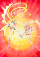
“When I drew this picture, I was still hesitant about what to do for Sailor Moon’s tiara design. I might not be able to draw such cute, bright color pictures of these two in their soldier forms anymore.”
- 381 X 543 mm.
- Title page of the April 1994 Nakayoshi.
- Cover: Color ink, color spray.
- Paper: Canson.
“Ooh, this is a really flashy color picture. But I really like the pose of these six. The hearts in the background are heart seals used for wrapping. I love using heart shapes and star shapes in color pictures. I used star seals in the picture on the previous page.”
- 380 X 540 mm.
- May 1994 Nakayoshi supplement.
- Media: Color ink, watercolor pencil, water-based marker.
- Paper: Arche.
“This picture is the cover for my supplemental notebook. I used unusual colors for the Nakayoshi supplement, a nice black and purple gradation. I asked Osabu for a mountain of them, and I use them for work. When I write the plot, when I scrap together order stubs, and when I make sample albums. I’m using it a lot now.”
- 380 X 528 mm.
- All-character drawn for use in the Picture Collection.
- Media: Color ink, marker, color spray, aeroflash.
- Paper: Fine BB Kent.
“Every year I make sure to draw an all-character picture for the Sailor Moon popularity poll that takes place in Nakayoshi, but I was on vacation for the December issue in ’94, and since that’s when they have the popularity poll, I could only draw a little cut. But then I kept at it, and drew this picture. Drawing this picture was fun. Without thinking, I accidently drew Sailor Moon and Hotaru-chan twice.”
- 380 X 341 mm.
- 1994 Banpresto stuffed doll box.
- Media: Color ink, marker, color spray.
- Paper: Fine BB Kent, Canson.
“This illustration was for use on the premium box package for Banpresto-san’s UFO catcher dolls of the ten soldiers. The dolls are all so cute! And they did each of the items well too. So in the same way, the cel of the ten soldiers I drew for it looks good too. I think it’s a rare box, but do you all have one?”
- 383 X 271 mm.
- First page of the June 1994 Nakayoshi.
- Media: Color ink, color spray.
- Paper: Fine BB Kent.
“This is the color picture of Uranus and Neptune’s appearance scene. I’m embarrassed, since in this picture their faces, hairstyles, and proportions aren’t stabilized yet. They’re different people. Speaking of which, these two in the anime are pretty different from the original, too. I was really shocked. They’re not supposed to be like this! But since all of the fans liked them, I was relieved.”
- 237 X 390 mm.
- Back cover of Kodansha Comics Vol. 8.
- Media: Color ink, copy, instant lettering.
- Paper: New plant herb, Paradise, rezakku [a Japanese word that derives from rezâ raiku – leather like].
“The model for the delta which became the stage for the third series was the emperor’s delta. When I look with the fengshui of the building I often go to there, the flow of my spirit isn’t very good. Maybe I was able to do the dark third series with help from that image. For this picture, I drew the three of them separately on other paper, tore the paper by hand, and pasted them onto one sheet. For the buildings, I painted color on a copy.”
- 383 X 270 mm.
- Title page of the July 1994 Nakayoshi.
- Media: Color ink, pastel, ball-point pen, instant lettering.
- Paper: Fine BB Kent.
“This is the first image I have of the three soldiers that I drew in color. In the third series, for me, these three are the three soldiers of the outer solar system who carry the three talismans. These three were always one set. A surprisingly great number of people took a liking to them, I was so glad. I’m happy.”
- 380 X 272 mm.
- Front cover of the April 1994 Nakayoshi.
- Media: Color ink, marker, pastel.
- Paper: Fine BB Kent.
“For the Nakayoshi cover, the layout person drew the color continuity, but this April issue’s Sailor Moon-chan, her face and her eyes are so round, she’s really cute. Speaking of which, the Sailor Moon and the others drawn by the Bandai-san designers are neck and neck with the anime’s for always being really cute.”
- 382 X 270 mm.
- First page of the September 1994 Nakayoshi (note: also the pin-up in volume 8).
- Media: Color ink, color spray.
- Paper: Fine BB Kent.
“This is the scene where Sailor Moon takes the legendary holy chalice. I found a photo collection of the Vatican at a book store, spread them out in my house, and one treasure caught my eye, the chalice. I wondered about such a divine item as that appearing next. In that way, I finished the image of the moon chalice.”
- 542 X 383 mm.
- Title page of the September 1994 Nakayoshi.
- Media: Color ink, pastel, color spray.
- Paper: Fine BB Kent.
“I did this picture thinking of drawing a picture in the style of William Blake. [See The Sailor Senshi Page for comparison.] In Sailor Moon’s right hand is the holy chalice, and in her left hand is the cane. And with the angel wings, this became kind of a religious-type painting.”
- 377 X 272 mm.
- Front cover of the September 1994 Nakayoshi.
- Media: Color ink, CG.
- Paper: Canson.
“When this became the Nakayoshi cover, they put a CG flash in the background. They put the same CG in this time, and I hope it comes out well. They made square drawing prints of this picture to use at a signing.”
- 543 X 380 mm.
- Title page of the November 1994 Nakayoshi.
- Media: Color ink, color spray.
- Paper: Fine BB Kent.
“Actually, I really love this Sailor Moon-chan. Her face, her kind of sexy pose, the background…”
- 374 X 275 mm.
- January 1995 Nakayoshi supplement.
- Media: Pencil, color ink, pastel, color spray, tone.
- Paper: Canson.
“I didn’t have time, so I drew this on paper quickly with pencil, then put the color in easily with pen. On top of the background pastel, I put on white tone, but I wonder how it will turn out.”
- 380 X 275 mm.
- Cover of Kodansha Comics Vol. 10.
- Media: Color ink, color spray, marker.
- Paper: Canson.
“I’m running out of colors for the comic covers, oh no! I realized I wasn’t using red, and decided to use red first. And since volume 10 should be commemorated, I worried about doing a simple, bright picture fitting Sailor Moon, and decided on this picture.”
- 372 X 259 mm.
- Cover of Kodansha Comics Vol. 8.
- Media: Color ink, color spray.
- Paper: Canson.
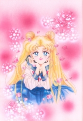
“I drew this picture on pink paper. I hope the color comes out well. In the Korean version of the comic, pink is really turning out well. For the flowers in the background, I put lace cloth doilies (so Ikuko-mama calls them. This is like making a lace flower vase.) on top of the paper, and forcibly sprayed white color spray on it.”
- 350 X 250 mm.
- Drawn for use in the Picture Collection.
- Media: Color ink, pencil, tone.
- Paper: Canson.
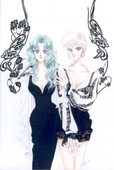
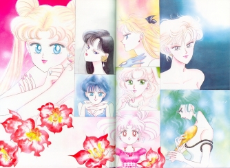
“When I decided on the content of the third series, and started writing down character creation, I drew this as an example of the feeling I wanted their civilian-clothed forms to have. It’s a doodle I never intended to publish anywhere. Their faces and hairstyles are still like they’re actually different people. Michiru-sama is such an adult. I just wanted to draw the clothes of these two.”
- 372 X 265 mm.
- Title page of the May 1994 Nakayoshi.
- Media: Color ink, color spray, pencil.
- Paper: Classical Fabriani.
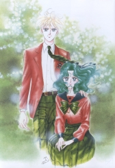
“I can’t think of these two as the same people at all as the two on the previous page. Especially since Haruka-sama is in male form. In the anime as well, I wanted to do a lot with Haruka-sama in male form. I was surprised to notice a number of people dressed in Infinity School uniforms at events. There were also girls in green wigs. Wow! Not just after transforming, I guess. But I love watching costume play, so I was happy.”
- 380 X 540 mm.
- Title page of the June 1994 Nakayoshi.
- Media: Color ink, color spray. Paper: Fine BB Kent.
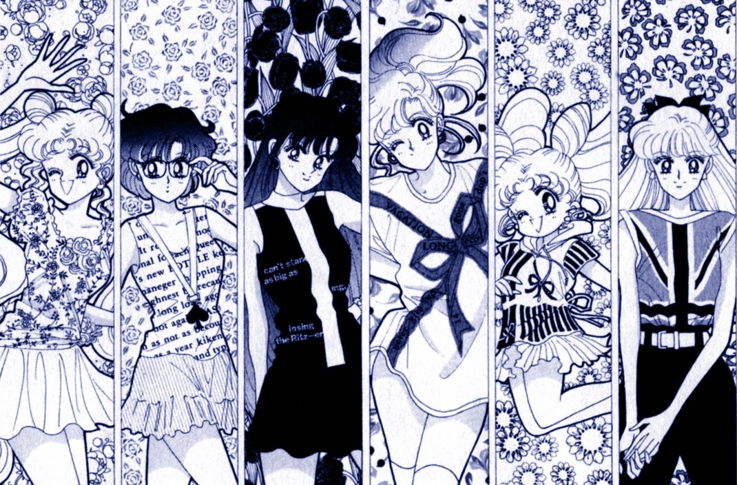
“This is the eight of them with different faces from normal. I like Usagi-chan’s face (even though it’s strange). I really like drawing the ten of them (though this is just eight) before transformation in one color picture with different facial expressions and poses. But drawing lots of people is troublesome since it takes so much time. Sigh…”
- 375 X 548 mm.
- Pin-up drawn for Kodansha Comics Vol. 7.
- Media: Color ink, water-based marker, color pencil, instant lettering tone.
- Paper: Canson, Paradise.
[This illustration is spread over two pages. Image above was merged by Terralune]
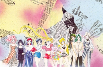
“When this became a poster in comic volume 7, I forgot to color in part of Mina-P’s hair. When it became the picture for April in the ’95 calendar, I colored the background over it. It’s a different version. This is the ten of them in plain clothes, which don’t appear much in the manga. By the way, Setsuna-sama wears hotpants as well at home, but basically she also likes long skirts.”

 392 X 545 mm.
- Title page of the August 1994 Nakayoshi.
- Media: Pencil, color ink, color spray.
- Paper: OK Muse Kaiser.
- [This illustration is spread over two pages. The image above is taken from a Sailor Moon CD-ROM.]
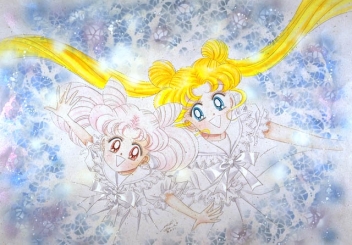
“This is the two of them in the style of models from Vogue Bambino (a really cute Italian children’s clothing magazine). The background colors I also used for the cover of Picture Collection I. They’re color spray I love, pearl blue and pearl purple. The color didn’t show up at all on the cover of Picture Collection I (and the grain turned out rough). I was really shocked (damnit!), but I hope it will show well this time.”
- 430 X 380 mm.
- September 1994 Nakayoshi supplement.
- Media: Color ink, color spray, gel medium, beads, lace, paper, water-based marker.
- Paper: Canson, Paradise.
“This cut of the two I drew for use as a file supplement. I attached the background lace paper and beads for use in the Picture Collection. I drew the checkers on their clothes with water-based marker. I hope the pink beads and their fluorescent orange background show well.”
- 283 X 374 mm.
- March 1995 Nakayoshi supplement.
- Media: Color ink, marker, poster color.
- Paper: Canson.
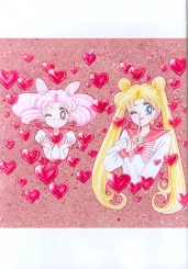
“These people and hearts I drew to be used as a supplement as well. I drew the background for use in the Picture Collection. This is a different version. I believe this color picture is the first time I used a Kopikku [Copic] marker. I didn’t have any interest in markers, but the art supply store I go to really recommended them, so I started painting a sample, and it was fun! Really fun! I didn’t think I could draw so many hearts.”
- 379 X 545 mm, 274 X 372 mm.
- July 1994 Nakayoshi supplement and original drawing.
- Media: Color ink, marker.
- Paper: Canson.
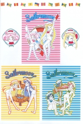
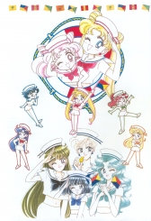
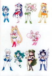
“It didn’t seem likely until now, but here are the ten of them in “sailor” form. For use in the Picture Collection, I also drew the four sailor forms of Haruka, Michiru, Setsuna, and Hotaru. The center three pieces on the right page were stationery designs. At that time I thought it would be an unusual, good supplement.”
- 381 X 285 mm.
- Front cover of July 1994 Nakayoshi.
- Media: Color ink, color spray, water-based marker.
- Paper: Arche.
“Until this picture, I had been using pink color ink for their skin for a while. But since the pink is emphasized so much when it’s printed, now I’m using fluorescent orange.”
- 374 X 272 mm.
- Front cover of the January 1995 Nakayoshi.
- Media: Color ink, marker.
- Paper: Canson, Japanese paper.
“For their kimono, I cut out Japanese paper and pasted it. I like kimono and yukata, so I want to dress the characters in them, and I have lots of book clippings to use as references, but… Anyway, there are ten of them, right? I thought about it, but drawing it would be so much trouble…”
- 152 X 380 mm.
- Table 2-3 for KC Deluxe The Lover of Princess Kaguya and supplement (Saturn).
- Media: Color ink, water-based marker.
- Paper: Fine BB Kent.
“I drew a cut of the ten super-deformed once, but since this was when Saturn hadn’t appeared in the plot yet, the cover of Lover of Princess Kaguya only had nine of them. Poor girl. The bordering of the figures is water-based marker. I like outlining people with water-based marker.”
- 381 X 271 mm.
- First page of the February 1995 Nakayoshi.
- Media: Marker, color spray.
- Paper: Fine BB Kent.
“This could be the first color picture of Sailor Moon where I didn’t use color ink. The people are done in marker. The background is color spray. The background is really brimming with fluorescence, it’s a very dazzling picture. But it probably won’t show in the printing. Sniff, sniff. I love fluorescence!”
- 372 X 275 mm.
- Front cover of the July 1994 Run-Run.
- Media: Color ink, color spray, tone, water-based marker.
- Paper: Canson.
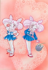
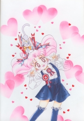
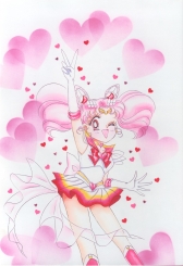
“I originally drew this color picture to show Toei-san the colors of Chibi-Usa-chan’s clothes. It’s her summer clothing and winter clothing. The summer clothing illustration was reserved especially for the Picture Collection I-II CD-ROM, and it was also made into a memo pad cover.”
- 373 X 265 mm.
- Front cover of the March 1995 Run-Run.
- Media: Color ink, marker, color spray, lace paper.
- Paper: Canson.
“When this was made into the front cover of Run-Run, the color I painted didn’t come out well at all (it was too dark), and I was really shocked at the picture. I wonder if it will show well this time. This is a pair with the picture on page 42 of Picture Collection I. Reproducing the painted color in printing is really hard, I guess. Sigh…”
- 382 X 272 mm, 381 X 273 mm.
- Title page of the March 1995 Run-Run.
- Media: Color ink, color spray, marker, seal.
- Paper: Fine BB Kent.
“This is the title page of the “Chibi-Usa’s Picture Diary” I write once a year. When it appeared in Run-Run, I put square opera pink designations in the background, but for the Picture Collection I’m just printing the original picture. Heart seals are attached in the background.”
- 537 X 380 mm.
- Cover of the KC Deluxe The Lover of Princess Kaguya.
- Media: Color ink, color spray, pastel, tone.
- Paper: Fine BB Kent.
“This picture is the cover of the tankoubon for the orignal work of the ’94 theater movie, The Lover of Princess Kaguya. Every time I look at this picture, it reminds me of the work making the tankoubon, the one scene of the movie, the reseaching of NASA, and more. In the enormous task of producing the movie, I had a little influence, and it was a very valuable experience. I want to try doing a movie again.”
- 393 X 273 mm.
- Inside front cover of the KC Deluxe The Lover of Princess Kaguya.
- Media: Pencil, color ink, color spray, copy, marker, seal.
- Paper: OK Sand Color.
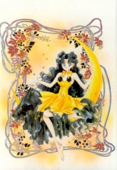
“This is Luna-chan’s human form from the movie version. I really like Luna-chan’s clothing here. I even heard Bandai-san was going to put out dolls of this Luna, but it’s too bad they didn’t. I wanted one! The background decoration is another version I made of a copy by painting in color with marker. I also like the hologram seals scattered in the background, and I use them a lot.”
- 396 X 272 mm.
- Back cover of the KC Deluxe The Lover of Princess Kaguya.
- Media: Color ink, marker, color spray, seal.
- Paper: New plant herb, Paradise.
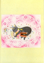
“This is Luna holding the phantom (?) Kakeru-san doll that didn’t appear in the manga or the anime. I wonder who made it for her? I meant the stars scattered around her to be confetti candies.”
- 373 X 274 mm.
- Cover of Kodansha Comics Vol. 11.
- Media: Color ink, color spray, gel medium, beads.
- Paper: Stone grain white.
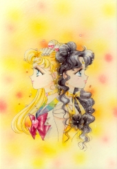
“For me, these two are two with a very closely similar existence. These two are defined in The Lover of Princess Kaguya, which is not to say they always act together and reveal their true feelings, but they understand each other. Even if they were to change places with each other, they surely would have taken the same actions with the same feelings. That’s why the color of their eyes is the same blue.”
- 545 X 383 mm.
- First page of the October 1995 Nakayoshi.
- Media: Color ink, ball-point pen, copy, seal.
- Paper: KMK Kent, harsh color marine blue, tracing paper.
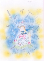
“This Saturn is drawn on top of tracing paper. Under that, I pasted tone with copied decoration, I pasted color copy and seals, and then I put it on cardboard. I love cutting and pasting! Oh, it’s fun. I use ball-point pen for the gold parts. This is one of the messiahs, Sailor Saturn.”
- 380 X 285 mm.
- First page of the January 1995 Nakayoshi.
- Media: Color ink, marker, color spray, modeling paste, pencil.
- Paper: Arche.
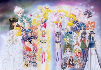
“And now the other messiah. The column where Selenity is standing I drew while looking at a picture of a column of an ancient temple of the Roman Forum I took when I went in the fall of ’94. The whole city of Rome is filled with historic ruins, a city so full of history it’s dizzying. With these two opposite pages, I’ve put together the two messiahs.”
- 525 X 367 mm.
- Title page of the March 1995 Nakayoshi.
- Media: Color ink, marker, color spray, gel medium, beads.
- Paper: Edo dye flower stone crimson.
“If I recall, I was drawing this picture until the day I left for New York at the end of the year, playing a staring game with the clock behind me. And my manager… And my tooth hurt, too! I finally finished it after I came back from my trip (in the new year). After I painted with marker, when I did the color ink, it really blotted together. I love the black dresses and hair colors of the ten of them.”
- 400 X 274 mm.
- Cover of Kodansha Comics Vol. 9.
- Media: Color ink, marker, color spray, seal, instant lettering.
- Paper: Rezakku [a Japanese word that derives from rezâ raiku – leather like].
“As expected, the last page of the Picture Collection is a picture of the ten soldiers. I like this picture, it has a cool and sort of lonely feeling. But when it became the cover of comic volume 9, one of the hologram star seals came off. Sniff… This Rezakku paper isn’t really good for color ink, but I love the way it spread and the parts where the paper shows.”
- 450 X 637 mm.
- Drawn for use in the Picture Collection.
- Media: Marker, color spray, pastel, aeroflash, tone.
- Paper: Fine BB Kent.
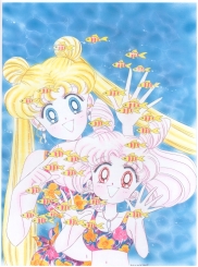
“This year as well, the Picture Collection goes on sale in summer. Because of that, this is the ten of them in swimsuit forms. I colored the people with marker. Deciding each of the swimsuit designs was fun. I wanted to draw a color picture with everyone wearing black swimsuits. In the middle, I changed my mind, and that’s why Usagi-chan is the only one in a white swimsuit.”
Final illustration is a fold-out poster of cover. No liner notes.
